11. Analyzing maps / graphs / charts
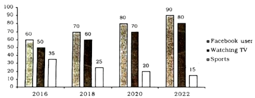
The graph below shows what percentage of time the college students in different areas of our country spend for pastime activities from 2016 to 2022 . Describe the graph in 150 words.
Pastime activities of the students in different areas of our country from
The graph given in the question paper represents a survey recently carried out on the students' pastime activities in different areas of our country from 2016 to 2022 . Overall, Facebook and watching TV got gradual increase throughout the whole period.
As we find in the graph, in of the students used Facebook, of them watched TV programmes and of them took part in games and sports. Again in 2018 , we notice that of the students used Facebook, of them enjoyed'TV programmes and of them participated in games and sports. Likewise in 2020, the state changed steadily and we find Facebook use, enjoying TV programme and participation in sports rate stood at and respectively. Finally, in 2022 , we find in the same way that of the students used Facebook, of them watched TV programmes and only of them took part in sports. A close study of the graph reveals that there was a gradual and steady rise in the first two sources of pastime- Facebook use and watching TV programmes. But what is most frustrating is that the participation in sports was gradually on the wane (হ্রাস পাওয়া).
To conclude, a striking feature of the graph is that sporting activities got declined during the years.
Ai এর মাধ্যমে
১০ লক্ষ+ প্রশ্ন ডাটাবেজ
প্র্যাকটিস এর মাধ্যমে নিজেকে তৈরি করে ফেলো
উত্তর দিবে তোমার বই থেকে ও তোমার মত করে।
সারা দেশের শিক্ষার্থীদের মধ্যে নিজের অবস্থান যাচাই
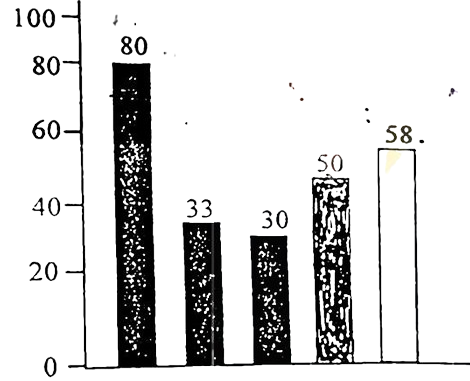
The graph below shows the importance and usage of English. Describe the graph in at least 80 words:
 (By serial)
Usage of English in information technology 80%
Usage of English as the 1st language 33%
Used in various organizations 30%
Used in other purposes 50%
Using English as the 2nd language 58%
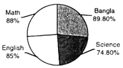
The pie chart shows the passing rates of different subjects of a school. Now, write a paragraph analyzing/describing the chart and give a suitable title to it.
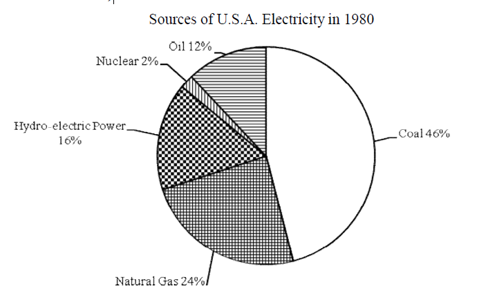
Look at the chart. It shows the sources of U.S.A. electricity in 1980. Now, analyze the chart focusing the main
aspects (At least in 150 words)
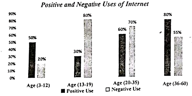
The graph below shows the positive and negative Uses of Internet according to different age groups of the users. Describe the chart at least in 150 words. You should highlight the information and report the main features given in the chart.