11. Analyzing maps / graphs / charts
The graph below shows the users condition of the social sites of mobile phone in internet for the last four years. Now, describe the graph highlighting the information given in the chart.
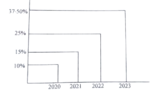
The graph illustrates the usage trends of various social media platforms on mobile phones over the past four years. It shows a clear upward trend in the use of all platforms, indicating increasing popularity and accessibility. Facebook has consistently maintained its dominant position, with its usage steadily rising over the years. Instagram, while starting from a lower point, has experienced significant growth, particularly in recent years. Twitter, although not as widely used as Facebook or Instagram, has also shown a steady increase in usage. Overall, the graph highlights the growing reliance on mobile devices for social media engagement and the evolving preferences of users.
Ai এর মাধ্যমে
১০ লক্ষ+ প্রশ্ন ডাটাবেজ
প্র্যাকটিস এর মাধ্যমে নিজেকে তৈরি করে ফেলো
উত্তর দিবে তোমার বই থেকে ও তোমার মত করে।
সারা দেশের শিক্ষার্থীদের মধ্যে নিজের অবস্থান যাচাই
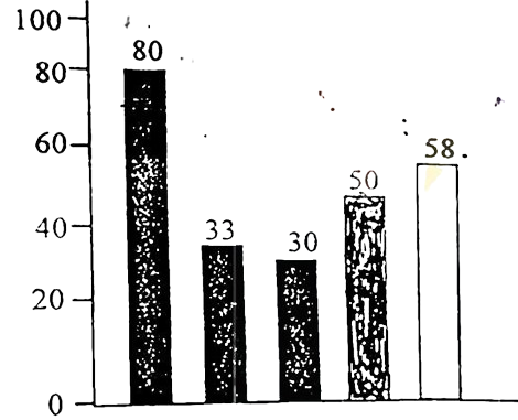
The graph below shows the importance and usage of English. Describe the graph in at least 80 words:
 (By serial)
Usage of English in information technology 80%
Usage of English as the 1st language 33%
Used in various organizations 30%
Used in other purposes 50%
Using English as the 2nd language 58%
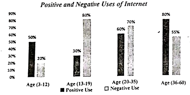
The graph below shows the positive and negative Uses of Internet according to different age groups of the users. Describe the chart at least in 150 words. You should highlight the information and report the main features given in the chart.
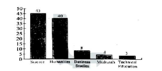
The graph below shows students from different academic areas who got themselves admitted into a public university last year. The left-aligned numbers show the percentages of students. You should analyse the information mentioning, the ratio of their achievements in at least 150 words.