11. Analyzing maps / graphs / charts
The graph below shows students from different academic areas who got themselves admitted into a public university last year. The left-aligned numbers show the percentages of students. You should analyse the information mentioning, the ratio of their achievements in at least 150 words.
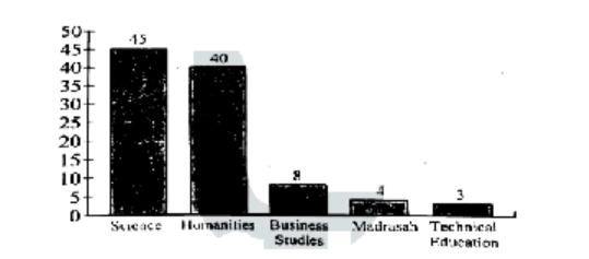
The bar graph illustrates admission percentages for various academic backgrounds at a public university in Bangladesh, revealing distinct trends among fields. Social Sciences leads with 45% of admissions, making it the most popular or accessible field, while Humanities follows with 30%, indicating a strong interest in these disciplines. There is a notable drop in admission rates for Business Studies and Madrasah, each representing 15% of the total, possibly due to a narrower applicant pool or limited available seats. Even more striking are the rates for Technical and Education fields, which stand at only 3% and 5% respectively, suggesting either stricter entry requirements or a more competitive selection process. Although the graph solely depicts admission distribution and not program prestige or academic difficulty, the differences may reflect varying capacities, applicant interests, and admission criteria, thus providing valuable insights for prospective students. This comprehensive view greatly assists in making informed application decisions.
Ai এর মাধ্যমে
১০ লক্ষ+ প্রশ্ন ডাটাবেজ
প্র্যাকটিস এর মাধ্যমে নিজেকে তৈরি করে ফেলো
উত্তর দিবে তোমার বই থেকে ও তোমার মত করে।
সারা দেশের শিক্ষার্থীদের মধ্যে নিজের অবস্থান যাচাই
 (By serial)