Analyzing Maps/Graphs/Charts
Look at the following graph. It shows the comparative number of death caused by road accidents in the first six months of the year 2022 and 2023. Now, describe the graph in your own words in 150 words. You are advised to highlight and summarize the information given in the graph.
Comparative number of deaths caused by road accidents in Bangladesh in the first six months of the year 2022-2023:
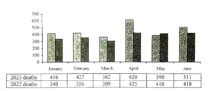
The graph shows the comparative number of death caused by road accidents in the first six month of the years 2022 and 2023. 416 people died by road accidents in January, 2023 and 340 people died in January, 2022. There were 427 deaths in February, 2023 and 356 deaths in February, 2022. The lowest number of deaths can be noticed in March of 2023 and 2022, which are 362 and 309 respectively. On the contrary, the highest numbers of deaths in the graph are shown to have occurred in April of 2023 and 2022 when 620 and 425 people died respectively. Then in May of 2023 and 2022 there were 390 and 410 deaths respectively. Lastly, June, with a number of deaths higher than May, recorded 511 people dead in 2023 and 418 people in 2022. In conclusion, the number of deaths in 2023 was higher.
Ai এর মাধ্যমে
১০ লক্ষ+ প্রশ্ন ডাটাবেজ
প্র্যাকটিস এর মাধ্যমে নিজেকে তৈরি করে ফেলো
উত্তর দিবে তোমার বই থেকে ও তোমার মত করে।
সারা দেশের শিক্ষার্থীদের মধ্যে নিজের অবস্থান যাচাই
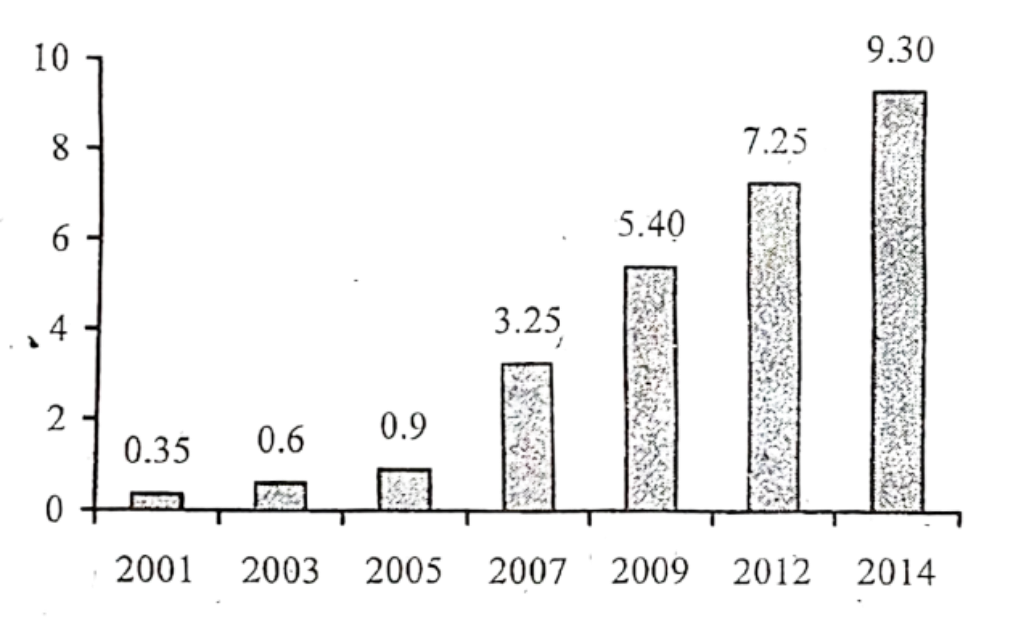
The graph below shows "The Number of Telephione and Mobile Users" from 2001 to 2014. Describe the graph in 150 words. You should highlight and summarize the information given in the graph.
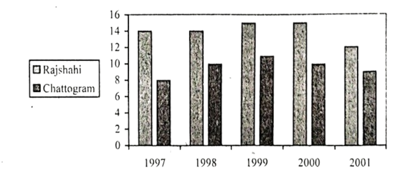
The chart below shows the minimum temperature (in Celsius) at Chattogram and Rajshahi in the years between 1997 and 2001. Describe the chart in 150 words. You should highlight and summarize the information given in the chart.
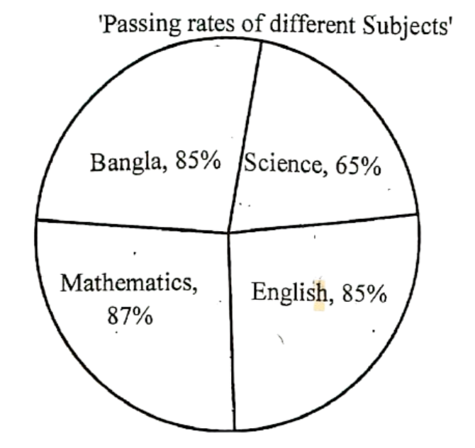
Look at the following pie-chart. It represents the passing rates of the students in different subjects of a school. Now, describe the chart in your own words.
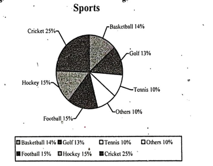
Look at the following pie chart. It shows the people's interest in sport activities. Describe the chart in 150 words. You should highlight and summarize the information given in the chart.