Analyzing Maps/Graphs/Charts
The chart below shows the minimum temperature (in Celsius) at Chattogram and Rajshahi in the years between 1997 and 2001. Describe the chart in 150 words. You should highlight and summarize the information given in the chart.
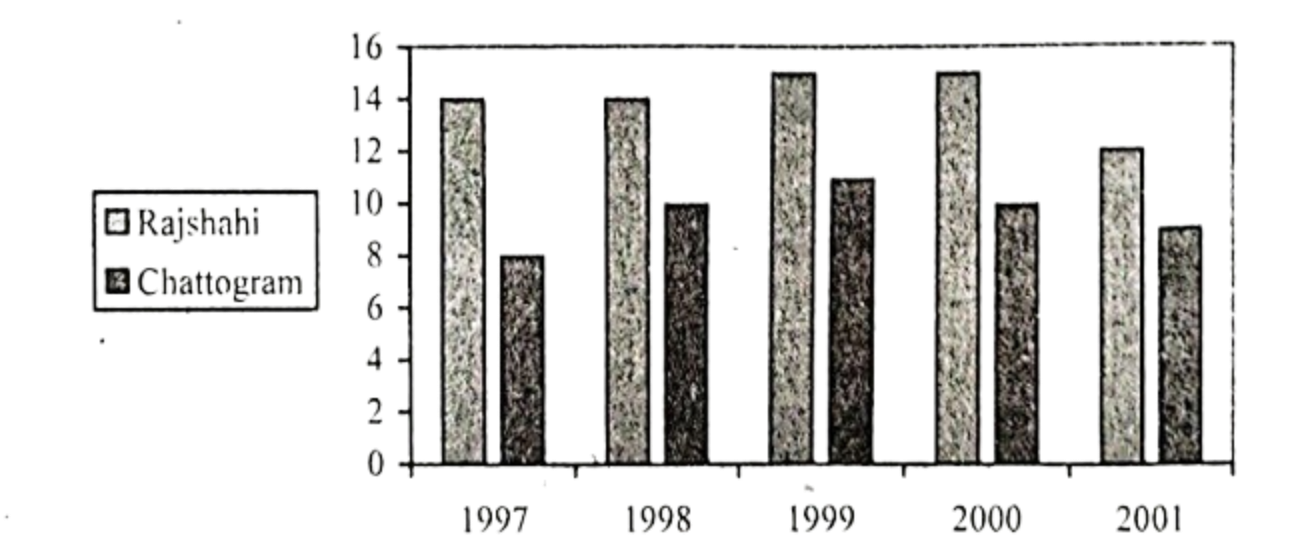
The chart provides the information about the minimum-temperature in Rajshahi and Chattogram in the years between 1997 and 2001. A picture of rise and fall in the temperature is noticed in the chart. In 1997, the minimum temperature in Rajshahi was . For Chattogram it was only . Next year (1998), the minimum temperature of Chattogram increased to but it remained unchanged for Rajshahi. In 1999, a slight increase is noticed in the minimum temperature in both Rajshahi and Chattogram. This year the minimum temperature of Rajshahi increased to which remained the same in 2000. On the other hand, in 1999, the minimum temperature of Chattogram increased to , but in 2000 , it decreased to . Finally in 2001, the minimum temperature decreased in both the regions. The bar of 2001 shows that the mipimum temperature in Rajshahi was and in Chattogram it was . So, overall the graph illustrates that both the regions experienced fluctuation in terms. of temperature measurement.
Ai এর মাধ্যমে
১০ লক্ষ+ প্রশ্ন ডাটাবেজ
প্র্যাকটিস এর মাধ্যমে নিজেকে তৈরি করে ফেলো
উত্তর দিবে তোমার বই থেকে ও তোমার মত করে।
সারা দেশের শিক্ষার্থীদের মধ্যে নিজের অবস্থান যাচাই
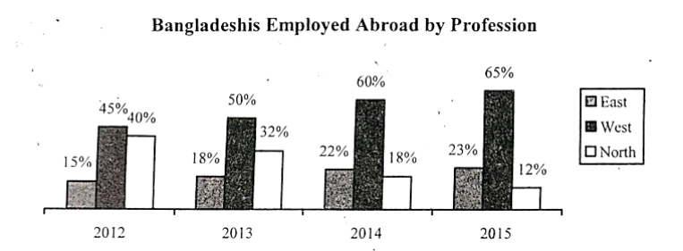
The graph below shows the number of the Bangladeshis employed abroad by profession. Describe the graph in 150 words. You should effectively highlight the information given in the graph.
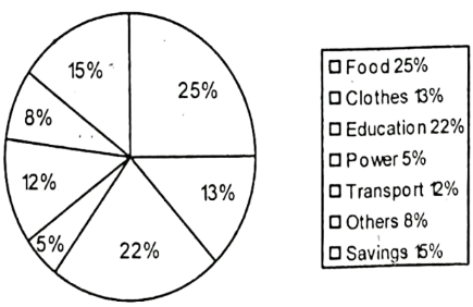
Look at the chart. It shows the distribution of percentages of a family's income into different categories. Now; analyze the chart in 150 words focusing the main aspects.
The distribution of the percentages of a family's income into different categories (%)
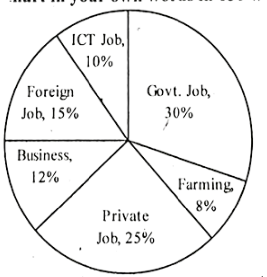
Look at the following pie chart. It shows the choice of professions by different educated youths in Bangladesh. Now describe the pie chart in your own words in 150 words.
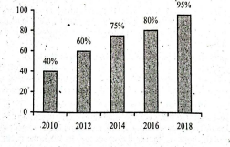
The graph below shows the number of people using mobile phone from the year 2010 to 2018. Describe the graph in 150 words. You should summarize the information given in the following graph.