Analyzing Maps/Graphs/Charts
The graph below shows "The Number of Telephione and Mobile Users" from 2001 to 2014. Describe the graph in 150 words. You should highlight and summarize the information given in the graph.
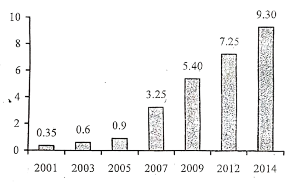
The graph represents the number of telephone and mobile users from 2001 to 2014. The graph shows a constant rise in the number of telephone and mobile users with the passage of time. In 2001, the number of telephone and mobile users was only 35 crore. Within two years, the number increased by .25 crore and became .60 crores. The rate of increase was almost same in the next two years. A massive increasing in the number of telephone and mobile users is noticed from 2005 to 2007. Within these two years, number of users increased to 3.25 crore. The increase rate became somewhat slow and from 2007 to 2009, it increased by 2.15 crore and rose to 5.40 crore in 2009 . The increase continues for the next two years also. Finally, in 2014 the number of telephone and mobile users became 9.30 crore which was 7.25 crore in 2012. So, from the analysis of the graph, it can be said that the number of telephone and mobile users is on rise and it is a clear indication that communication system is being developed.
Ai এর মাধ্যমে
১০ লক্ষ+ প্রশ্ন ডাটাবেজ
প্র্যাকটিস এর মাধ্যমে নিজেকে তৈরি করে ফেলো
উত্তর দিবে তোমার বই থেকে ও তোমার মত করে।
সারা দেশের শিক্ষার্থীদের মধ্যে নিজের অবস্থান যাচাই
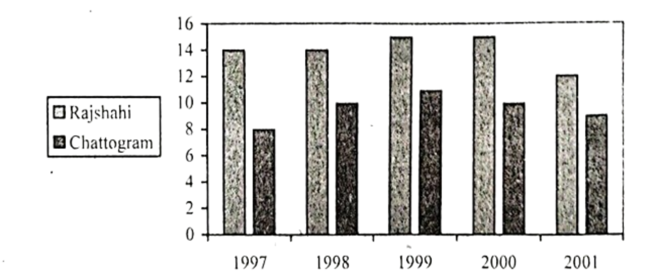
The chart below shows the minimum temperature (in Celsius) at Chattogram and Rajshahi in the years between 1997 and 2001. Describe the chart in 150 words. You should highlight and summarize the information given in the chart.
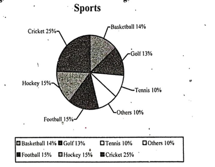
Look at the following pie chart. It shows the people's interest in sport activities. Describe the chart in 150 words. You should highlight and summarize the information given in the chart.
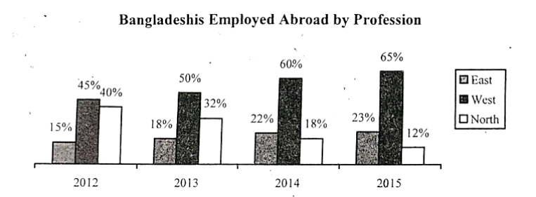
The graph below shows the number of the Bangladeshis employed abroad by profession. Describe the graph in 150 words. You should effectively highlight the information given in the graph.
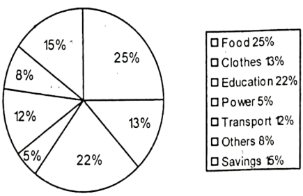
Look at the chart. It shows the distribution of percentages of a family's income into different categories. Now; analyze the chart in 150 words focusing the main aspects.
The distribution of the percentages of a family's income into different categories (%)